| ALBUM |
ALBUM & COMMENTS |
| |
|
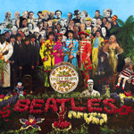 |
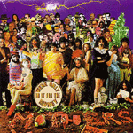
| Beatles: Sgt Pepper's Lonely Hearts Club Band (1967) |
| Art director Robert Fraser in association with McCartney created this Grammy Award-winning album packaging "Sgt Peppers's Lonely Hearts Club Band". The album features life-sized cardboard models of famous people picked by each beatle's member. The collage depicts more than 70 famous people including musicians, writers, stars, indian gurus. The cover is so famous that there are so many myths surrounding it especially with Paul McCartney. There is even a book written about all the clues. read more... |
|
| |
|
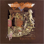 |
| AeroSmith: Toys in the Attic (1975) |
| Toys in the Attic released on April 1975. Well design cover, nice graphic, details, and drawing. Set up the idea and concept of the whole album very well with a little bit touch of AeroSmith style there. |
|
| |
|
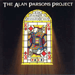 |
| The Alan Parsons Project: The Turn of a friendly card (1980) |
| Very eye-catching design. Using a very bright color to grab customers attention. No information in why has to be King of diamonds, maybe it works well with the overall design of the stained glass window. |
|
| |
|
 |
| All Man Brothers Band: Eat a Peach (1972) |
| Very clean graphic and very well done color of choice. Smooth and grab attention. Like the color effect of the background and the idea of the peach on the All Man Brothers Band's truck kind of cute. |
|
| |
|
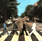 |
| The Beatles: Abbey Road (1969) |
| One of the most talk about album cover of all time and make one road the most important spot for tourists. Album also features one of the most phenomenon myths of all time, Paul Is Dead clues. read more
|
|
| |
|
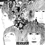 |
| The Beatles:
Revolver (1966) |
| German artist Klaus Voormann designed and created this cover. Nice drawing and very details. Very Beatles. The album received the Grammy Awards of 1967 for the best graphic artist. |
|
| |
|
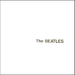 |
| The Beatles:
White Album (1968) |
| This is the classic album cover. Clean and slick. In my opinion, this is one of their best album covers. The album influenced many artworks to follow its slick style. |
|
| |
|
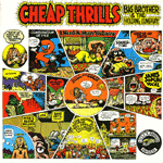 |
| Big Brother & the Holding Company: Cheap Thrills (1968) |
| The cover was designed and drawn by underground cartoonist, Robert Crumb and was considered as one of the most memorable album cover in rock history. The cover contains every song titles featured in the album (nice!). Great color and well drawing. |
|
| |
|
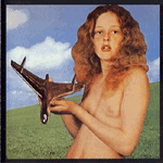 |
| Blind Faith: Blind Faith (1969) |
| One of the most controversy album covers in the 60's. Featuring with the topless girl holding something like a spaceship (for me look like phallic). Furthermore, whether the girl on the album was Baker's daughter or a kept slave by the band. The album also was nameless. Overall the cover well constructed and grab attention. |
|
| |
|
 |
| Bob Dylan: Self Portrait (1970) |
| Self Drawing by Bob Dylan. The album does not have any title. Dylan told in the Rolling Stone that he did this drawing in about 5 minutes. However, this album was considered the worst album of Bob Dylan throughout his career. |
|
| |
|
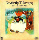 |
| Cat Steven: Tea for the Tillerman (1970) |
| The album was created by Steven, a former art student. I like the color of the album kind of cheerful, and the drawing quite nice. As many drawing done by the renaissance artists, there are some hidden detail on the cover. |
|
| |
|
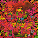 |
| Cream: Disraeli Gears (1967) |
| This amazing cover art was drawn by Martin Sharp, Australian artist. Eye catching, strong aggressive colors and very detail oriented. Martin Sharp also wrote the poem on a piece of napkin given to Clapton for using as lyric in the song Tales of Brave Ulysses |
|
| |
|
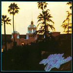 |
| Eagles: Hotel California (1976) |
| The image is the Beverly Hills Hotel. There is a myth surrounding this album cover including the title of the album linked to Satanic by the evidence of a horned figure peering down from the balcony. Eventually, the band denied such claims. |
|
| |
|
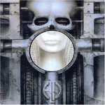 |
| Emerson, Lake & Palmer: Brain Salad Surgery (1973) |
| Featuring the cover created by well renowned artist H.R. Giger (Alien artist) and Fabio Nicoli, the album cover has two versions (if I'm right) including dark blue color and yellow rust color. Very well done in Giger style, great graphic color both front and back showing talent and imagination of the artist. |
|
| |
|
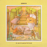 |
| Genesis: Selling England by the Pound (1973) |
| The cover was well drawn, good multi color technique and very well balance. I like cover that drawing like fairly tales book for children, because it usually tells some story or overall idea of the piece. |
|
| |
|
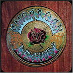 |
| Grateful Dead: American Beautiful (1970) |
| Ranged as one of the best album covers by Rolling Stone, American Beautiful by Grateful Dead was nicely constructed by Kelly-Mouse Studio. Good color and choice of texture, showing the soft of the title on the hard dark wood in the heavy rock style. |
|
| |
|
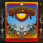 |
| Grateful Dead:
Aoxomoxoa (1968) |
| Another one of the best album covers by Rolling Stone, Aoxomoxoa was created and done by artist Rick Griffin. His concept is a concoction of symbols, which mainly tie together in the birth to death cycle. A grinning skull grasps two eggs, while embryos, and seeds live under the ground, sending up trees and lotus flowers. The sun image, looked at from a slightly different angle, could be construed as an egg being beset by sperm. The scarab which resides squarely in the middle of the "M" at the bottom of the painting is, according to The Encyclopedia Britannica "In ancient Egyptian religion, important symbol in the form of a dung beetle. The Egyptians apparently believed that the beetle laid its egg in the ball of dung, which it rolled to its burrow and consumed; they saw in the life cycle of the beetle a microcosm of the cyclical processes in nature, and particularly of the daily rebirth of the sun. The scarab became a symbol of the enduring human soul as well." (Steve Silberman; Skeleton Key, 1995) |
|
| |
|
 |
| Harry Chapin: Verities & Balderdash (1974) |
| Very artistic graphic, almost abstract. I think it has a very profound art kind of thing (I hope) and the title said it all. |
|
| |
|
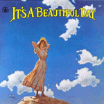 |
| It's a Beautiful Day: It's a Beautiful Day (1969) |
| Good cover, very direct. It's a beautiful day and yes, it is. Very relax and well designed. |
|
| |
|
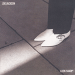 |
| Joe Jackson: (Look Sharp! 1979) |
| Look Sharp! was one of the greatest album covers in Rolling Stone. Very conceptual and straight up to the point. It brought up a dramatic study of Joe Jackson's shoes. Joe Jackson just bought this Denson's shoes the day before shooting for the album and Brian Griffin took just one or two shots as part of an entire day doing other shots. Finally, they decided to use one of the shot as the cover. |
|
| |
|
 |
| John Lennon and Yoko Ono: Live Peace in Toronto (1969) |
| Very peaceful like the title says. I think this is one of my favorite album cover. So peaceful and telling stories of the artists giving the same feeling like sitting and looking up on the sky. John and Yoko chose a painting by Yves Klein called simply blues. Lennon recommended the image a single cloud. "By us putting a cloud there," says Ono, "it suddenly became the real sky -- and the real world -- as opposed to perfection." |
|
| |
|
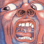 |
| King Crimson: In the Court of the Crimson King (1969) |
| King Crimson's popular album cover, In the Court of the Crimson King was represented very well the band image and concept. Good color and graphic, very aggressive and emotional too. |
|
| |
|
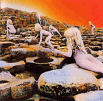 |
| Led Zeppelin: House of the Holy (1973) |
| The cover was influenced by the Arthur C. Clarke's novel. It is a collage of several photographs shot at the Giant's Causeway, Northern Ireland by Aubrey Powell. Although, the photoshoot was unsatisfied, the accident tinting effects in the post production crated an amazing graphic album cover. This is one of the controversy album of Led Zeppelin and was banned in some country because of the child pornographic. |
|
| |
|
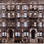 |
| Led Zeppelin:
Physical Graffiti (1975) |
| One of the Led Zeppelin most popular album, Physical Graffiti features the photo of the building located at 96 and 98 St. Mark's Place between 1 st and A. Ave. in New York City. The original album jacket for the LP included die-cut windows on the building shown on the cover; as the inner sleeves for the discs were inserted in different orientations, various objects and people would appear in the windows. The building still remains the same after 30 years. Number 98 currently houses the Physical Graffiti boutique and number 96 has Starfish & Jelli, clothing, accessories and gifts. In the production, forth floor was removed to be able to fit the building for the square jacket size. The cover was designed by Mike Doud and Peter Corriston. And it was photoshot by Elliot Erwitt. |
|
| |
|
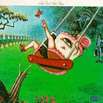 |
| Little Feat: Sailin' Shoes (1972) |
| Released by Little Feat, Sailin's Shoes is the band's second album. The art on the cover is nice, influenced by Louis XIV. Neon Park was the artist who designed and created this cover. I believe It is the lady-cake with the red shoes on the swing. Mick Jagger also dressed as Gainsborough's Blue Boy. On the back, artist Bruegel worn one of his trademark upside-down funnels and peeked from behind a pillar. |
|
| |
|
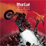 |
| Meat Loaf: Bat out of Hell (1977) |
| Designed by the most renowned fantasy artist and illustrator for heavy metal magazine, Richard Corben. The artwork straight up to the concept of the album title Bat out of Hell. |
|
| |
|
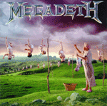 |
| Megadeth: Youthanasia (1994) |
| One of the great conceptual albums, Youthanasia. Megadeth put the first concept about a lack of respect and attention old people show toward the younger generation matching up with the cover babies being hung out to dry. Great artwork concept and well done graphic. |
|
| |
|
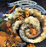 |
| The Moody Blues: A Question of Balance (1970) |
| Excellent graphic design, A Question of Balance has a distinctive artwork interpreting the controversy resulting from the ongoing Vietnam War. |
|
| |
|
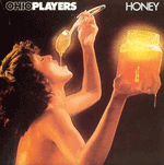 |
| Ohio Players: Honey (1975) |
| Honey by Ohio Players is well graphic designed by Joe Kotleba and photoshot by Richard Fegley. I like the photoshoot because it well passes the statement and feeling through the photo to the people. |
|
| |
|
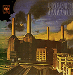 |
| Pink Floyd: Animal (1977) |
| One of the great album covers, Animal by Pink Floyd. Very idealism and hidden massage. I believe there is a inflatable pink pig floated on the air and flying around over the classic Battersea Power Station. The original Pink Floyd pig was designed by Roger Waters and built in late December 1976 for shooting the cover. There is a website totally dedicated to this album and has the story about how to get the inflated pig up on the air, flew into the flight path of the airplanes and then crashed into the field. |
|
| |
|
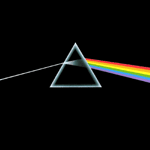 |
| Pink Floyd: The Dark Side of the Moon (1973) |
| Very well interpretation album cover, The Dark Side of the Moon, designed by Storm Thorgerson and Aubrey Powell, wants to show another side of a man depicted as a prism refracting white light into the visual spectrum. |
|
| |
|
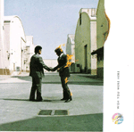 |
| Pink Floyd: Wish You Were Here (1975) |
| Storm Thorgerson designed this Pink Floyd album, Wish You Were Here. He said The fire was a symbol for getting burned or hurt in a relationship,". As for the handshake, he says, "it's regarded sometimes as a very false communication, especially in America, where a lot of hand-shaking goes on." Another photograph shows a man diving into a lake without creating a splash. "Is he there?" says Thorgerson. "In a sense, you might say there are no traces of his presence." |
|
| |
|
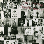 |
| The Rolling Stones: Exile on Main St. (1972) |
| With the concept of chaotic, the Exile on Main St. album captures the feeling perfectly. Designed by the photographer Robert Frank. He used his assorted pictures of circus freaks he took in 1950 of the wall of a tattoo parlor on Route 66. One of the most memorable photograph on this cover might be the one of a guy holding three balls in his mouth. |
|
| |
|
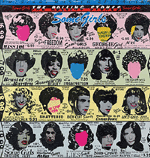 |
| The Rolling Stones:
Some Girls (1978) |
| Designed by Peter Corriston, Some Girls features the nice die-cut design with various of faces from the band and selected female celebrities in garish drag, as well as a bunch of lingerie advertisements. Some faces had been removed because of the possible lawsuit threaten by those girls. |
|
| |
|
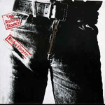 |
| The Rolling Stones: Sticky Fingers (1971) |
| Another controversy album cover of the 70's, Sticky Fingers was an innovative design in putting zipper on the album cover. However, the most controversy was when several department stores refused to display the album because of the model's snug jeans and you can probably see his (might be) sticky finger if you stand back from that cover. |
|
| |
|
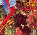 |
| Santana: Abraxas (1970) |
| In 1970, Santana was taken to Mati Klarwein's studio to check out his artwork for a possible album cover and picked this one. Klarwein painted this pictures in 1963 inspired by the symbolism from the story of the bible in which the archangel Gabriel announces to Mary that she will be giving birth to Jesus. |
|
| |
|
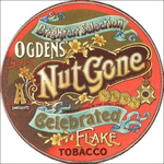 |
| Small Faces: Ogden's Nut Gone Flake (1968) |
| This album was originally released on vinyl in a round package duplicating a paper replica of a giant tobacco tin, with a fold out cover. |
|
| |
|
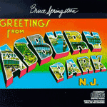 |
| Bruce Springteen: Greetings from Asbury Park, N.J. (1973) |
| Designed by John Berg, courtesy photograph by Tichnor Bros, Greetings from Asbury Park, N.J. is considered one of the greatest album covers by Rolling Stone. Very well design and good color of choices. |
|
| |
|
 |
| Supertramp: Breakfast in America (1979) |
| Without any of band's members on, Supertramp album cover, Breakfast in America was designed by Mike Doud. The background is the miniature Manhattan built out of many breakfast implements. The motif inspired a huge promotional campaign that featured such items as laminated menus, spoons, plates and cans of orange juice. The busty beautiful lady holding a glass of orange juice represents the Statue of Liberty. |
|
| |
|
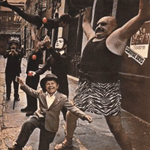 |
| The Doors: Strange Day (1967) |
| This is one strange day it is. They invited several strange carnivalesque giant, acrobats, juggler, and midget to be photographed on the cover. |
|
| |
|
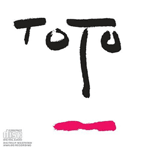 |
| Toto: Turn Back (1981) |
| Toto released their third album Turn Back with their signature band's name on the cover. Toto always plays with their band's name on the cover but this one is quite unique, the letter works very well imitate the face. The album was designed by Tony Lane and lay out by Milt Design. |
|
| |
|
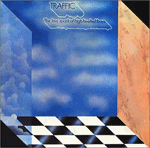 |
| Traffic: The Low Spark of High Heeled Boys (1971) |
| Designed by Tony Wright, The Low Spark of High Heeled Boys cover describes how Traffic's music sound like. The checkerboard dance floor represents rock n' roll (the grounding of the band and a point of departure). The wall are elemental, t he clouds on the left, representing water in its most ethereal form (the endless transition of day to day life), while the marble on the right represent the earth at its most enduring (indestructible spirit'). And of course, there is no ceiling' on the cube the sky is the limit', leaving the impression of the endless possibilities of life. (Dan Ropek, review, 98) |
|
| |
|
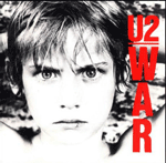 |
| U2: War (1983) |
| With the concept of anti-war, U2 released this album War in 1983. The cover designed by Steve Averill features now twelve year old boy Peter Brown, who unintentionally bore a bloodied cut on his bottom lip. The truly startling image on the cover was not the lip, but of the child's eyes, however wild, wide-eyed, almost fearful, and obviously brave. The original production featured the white background mismatched to the album mood. Averill found a piece of rusted corrugated metal to add texture to the image. |
|
| |
|
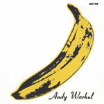 |
| The Velvet Underground: The Velvet Underground & Nico (1967) |
| As known as The Banana Album, The Velvet Underground & Nico features the peelable banana and you will discover the pink banana inside. This album was designed by Andy Warhol and became his most famous cover artwork of all time. |
|
| |
|
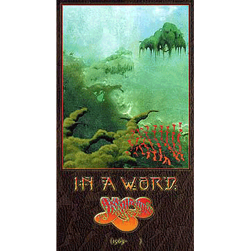 |
| Yes: In a Word (2002) |
| I always love the album covers of Yes. It is very well done, fantasy, myths orientation, and beautiful graphic. In A Word is one of the beautiful album released as the compilation by Rhino Record. |
|
| |
|
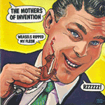 |
| Frank Zappa: Weasels Ripped My Fresh (1970) |
| Weasels Ripped My Fresh was released on 1970 with the direct statement on their album. Neon Park was a poster artist and was called to design for the next Zappa's album. Very well design, stylish, and kind of offensive artwork. |
|
| |
|
 |
| Frank Zappa We're Only in It for the Money (1968) |
| Frank Zappa released the album We're Only in It for the Money which parodies the Beatles great album Sgt. Pepper's Lonely Heart Club Band. This mimic album cover lands on one of the greatest album covers by Rolling Stone. |
|
| |
|
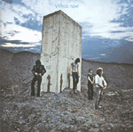 |
| The Who: Who's Next (1971) |
| Photographed by Ethan A. Russel, Who's Next was shot on a large concrete block used to hold slag heaps together and noticed their resemblance to the alien monoliths in Kubrick's film 2001: A Space Odyssey. The band decided to urinate on the Monoliths and that actually the water carried over in film cans. |
|
| |
|
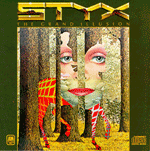 |
| Styx: (The Grand Illusion 1977) |
| Carte Blanche is the title of the Styx cover art Grand Illusion. The art was designed by one of the renowned artist Rene Magritte. Styx intended to released their album on 7/7/77 for their 7 th album. Very beautiful and very artistic art work interprets the album concept. |
|
| |
|
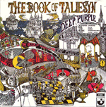 |
| Deep Purple: The Book of Taliesyn (1968) |
| Under the art direction of Les Weisbrich, John Vernon Lord draws and paints this amazing wonderland. Very high detail orientation and great color. |
|
| |
|
